EMI Part I
EMI Part I
EMI Part I
Redesigning the EMI website to improve user experience and user-friendliness, while adding new features.
Redesigning the EMI website to improve user experience and user-friendliness, while adding new features.
Redesigning the EMI website to improve user experience and user-friendliness, while adding new features.
Company
Company
Company
aCommerce
aCommerce
aCommerce
My Role
My Role
My Role
UX/UI Internship
UX/UI Internship
UX/UI Internship
Time Frame
Time Frame
Time Frame
Aug 2023 - Nov 2023
Aug 2023 - Nov 2023
Aug 2023 - Nov 2023
Project Overview
Project Overview
Project Overview
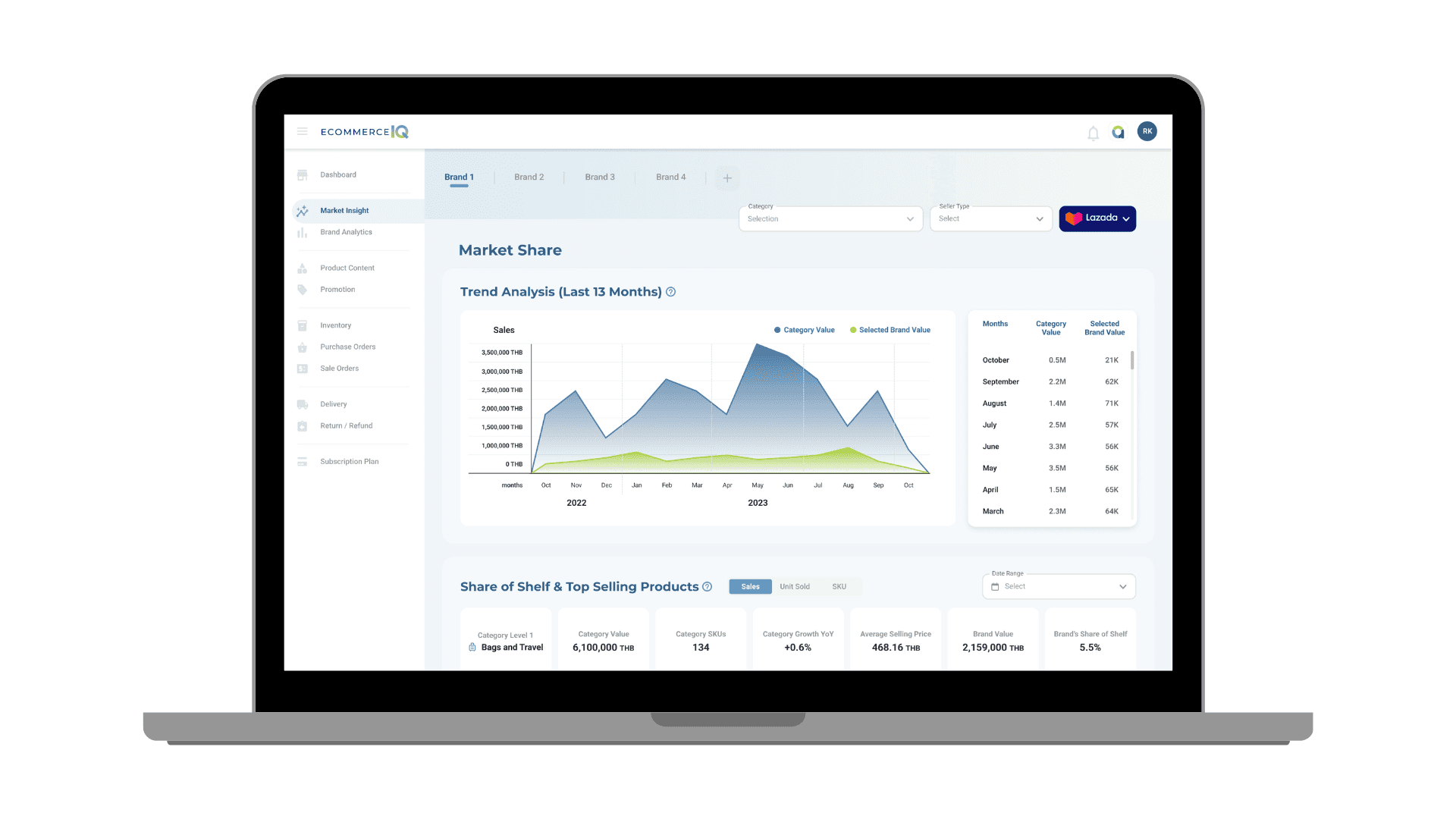
The EMI website, found on the EIQ website, provides data and market insights from online marketplaces. This data helps to evaluate brand performance and market positions.
The EMI website, found on the EIQ website, provides data and market insights from online marketplaces. This data helps to evaluate brand performance and market positions.
My Contribution
My Contribution
My Contribution
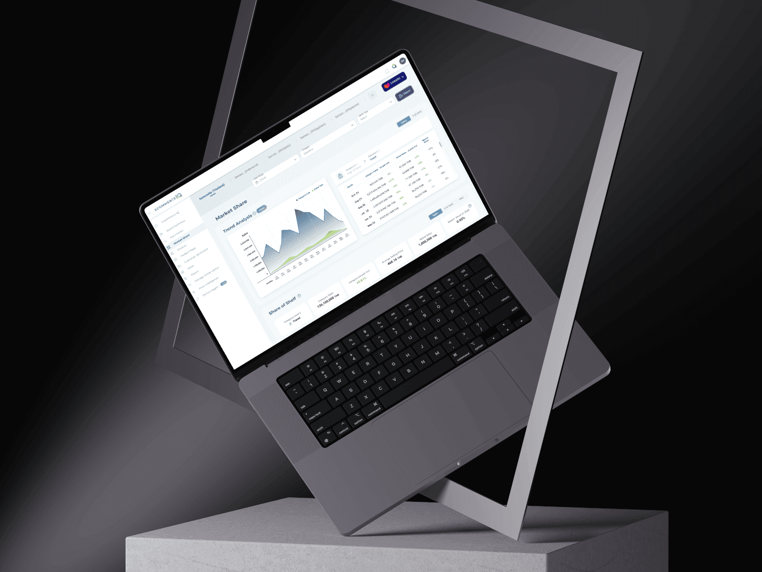
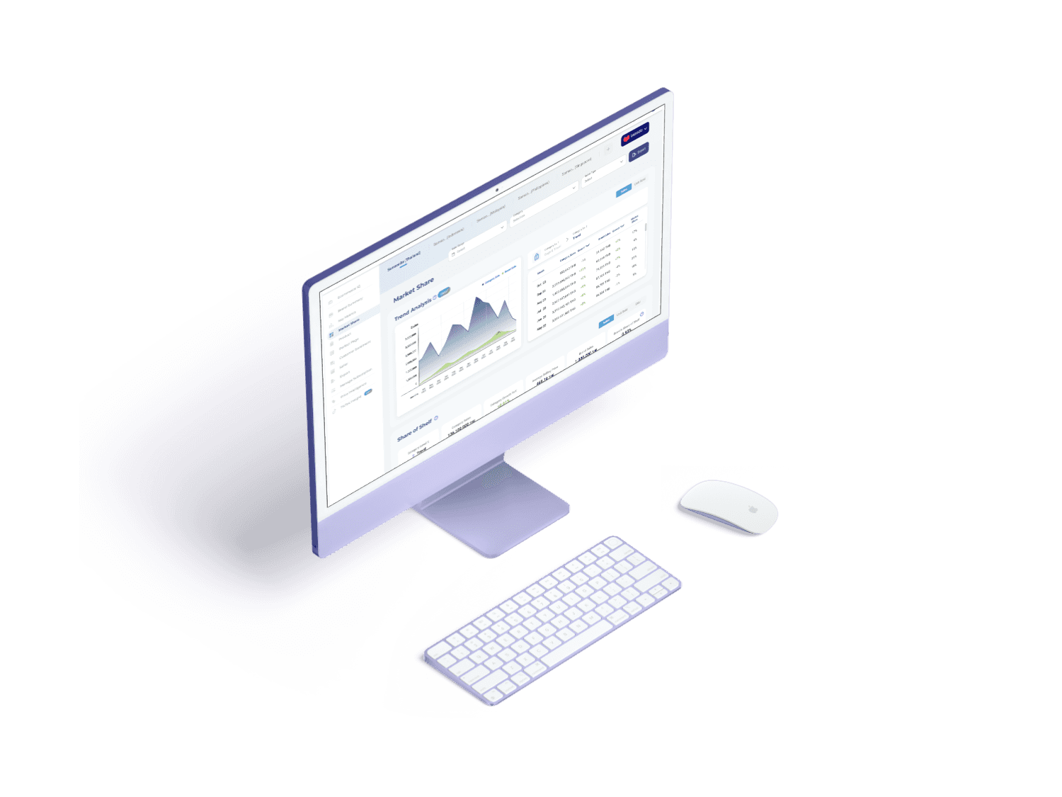
Currently, I redesigned 2 pages, including the market share and product page.
Moreover, I created a prototype of the market share page for preparing the usability testing.
Currently, I redesigned 2 pages, including the market share and product page.
Moreover, I created a prototype of the market share page for preparing the usability testing.
HOW DID IT ALL START
HOW DID IT ALL START
1
UNDERSTANDING
UNDERSTANDING
Before redesigning, We took the initiative to explore this website, conducting research to enhance
my understanding of e-commerce principles and specific industry vocabulary.
Before redesigning, We took the initiative to explore this website, conducting research to enhance
my understanding of e-commerce principles and specific industry vocabulary.
Discover:
Discover:
First, We focused on the market share page. They consist of 4 sections, which include category selection, category summary,
the share of shelf, and table of top-selling. These 4 sections were challenging to use and comprehend. To improve these 4 sections:
Category selection: using too much spacing, which is not the best practice.
Category summary: Only provides text information.
Share of Shelf: this current graph is difficult to understand.
Table of top-selling: the table of top-selling items lacks details.
*Noted, I cannot show the current website because of confidentiality reasons.
2
DEFINE AND RESEARCH
DEFINE AND RESEARCH
Define:
Define:
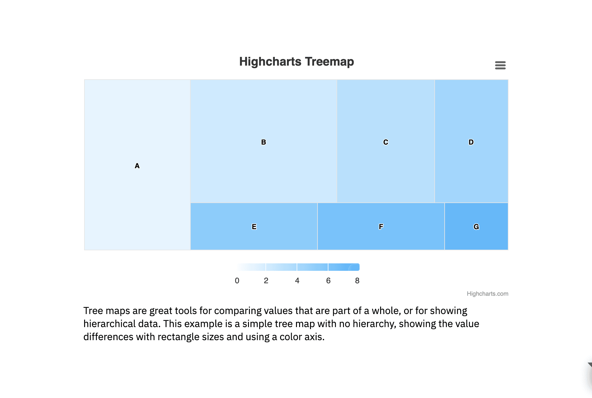
We researched the appropriate type of graph and found that a "Treemap" chart was the best option for creating the composition charts.
We researched the appropriate type of graph and found that a "Treemap" chart was the best option for creating the composition charts.
After researching the TreeMap Chart, we shifted our focus to the top-selling table. It lacks filters and details. According to the user behavior, most users frequently use "sort by price" and they want to filter the price range more specifically. So, we provide more filters to make it easier for users, while maintaining the current filter. As a result at the following lists below:
Price range
Brands
Seller name
Search bar for product title and number of SKU's
Moreover, we added "show/hide" filter to customize as users wanted.
3
Solution
Solution
Visualize:
Visualize:
Converted from the category selection to the dropdown selection.
Redesigned from text information to a better visual.
Improved the graph to be easier to understand.
Provided detailed information and filters that allow for greater customization.
Converted from the category selection to the dropdown selection.
Redesigned from text information to a better visual.
Improved the graph to be easier to understand.
Provided detailed information and filters that allow for greater customization.
4
Design
Design
5
Deliver
Deliver
Challenge and Learning:
Challenge and Learning:
I created a prototype of the market share and top-selling table for usability testing by the internal team and new users. The feedback I received was to improve certain parts and make them more convenient for users.
The challenging part is that this is not the first time I have conducted a usability test. However, testing with experts and new users whom I have never met before makes me excited and eager to ensure that everything is mistake-free.