1
Direct Competitors
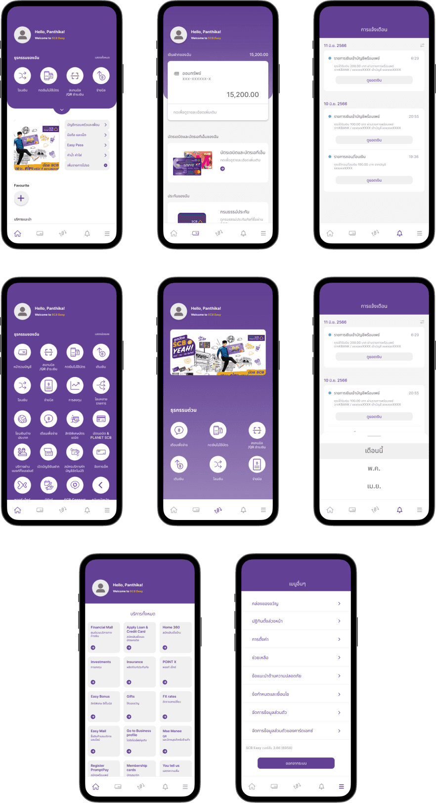
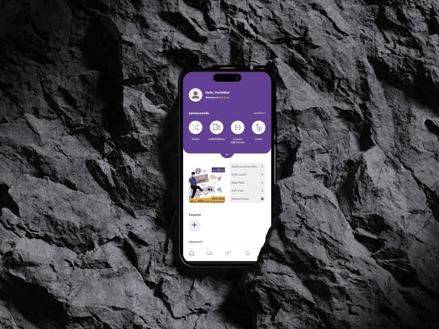
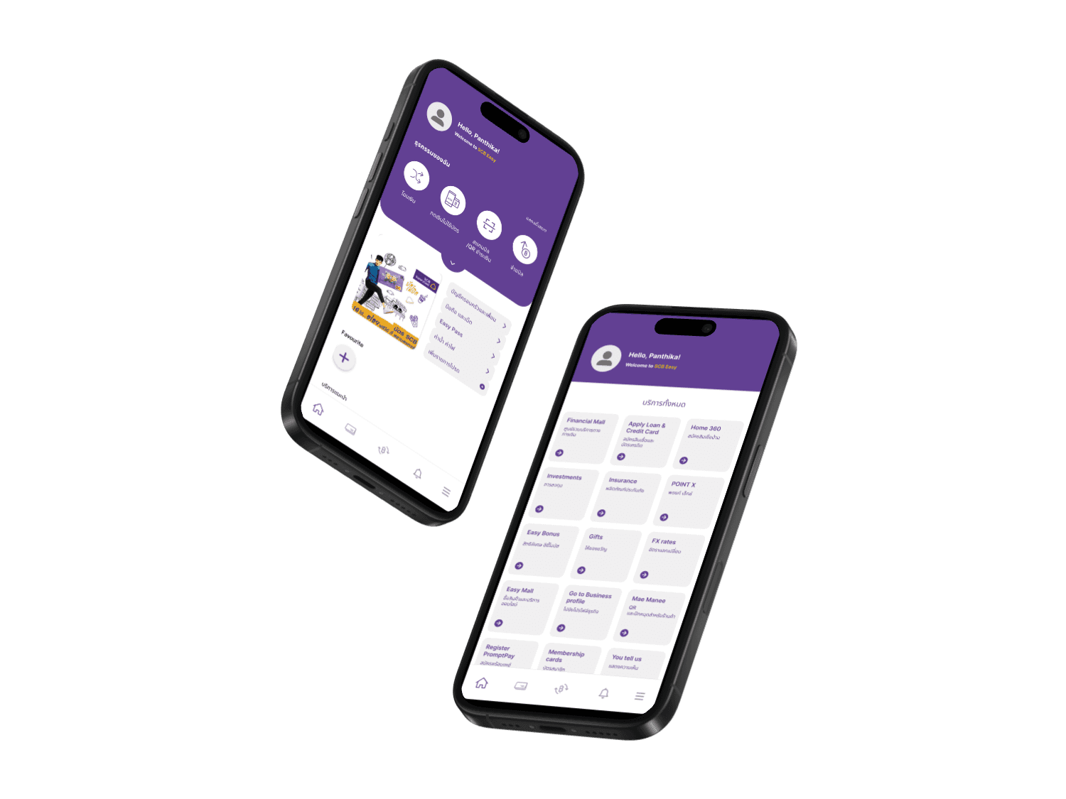
K PLUS
Strength:
Having a user-friendly interface that is easy to navigate and access transactions for users.
Conveniently viewing the account balances, transaction history and real-time notifications.
Strong security measures.
Weakness:
Limited features such as investment options
Depending on a stable internet connection
Mostly has an issue with transactions after midnight
Bualuang mBanking
Strength:
Providing many of banking services such as fund transfers, bill payments, etc.
Convenience of accessing banking services anytime and anywhere through their mobile devices.
Weakness:
Slow loading of the feed page and application crashes
Depending on a stable internet connection
New users can struggled with unfamiliar features.
Krungthai NEXT
Strength:
As a new version, it has a user-friendly interface and modern style.
Weakness:
Slow loading of the feed page and application crashes
Depending on a stable internet connection
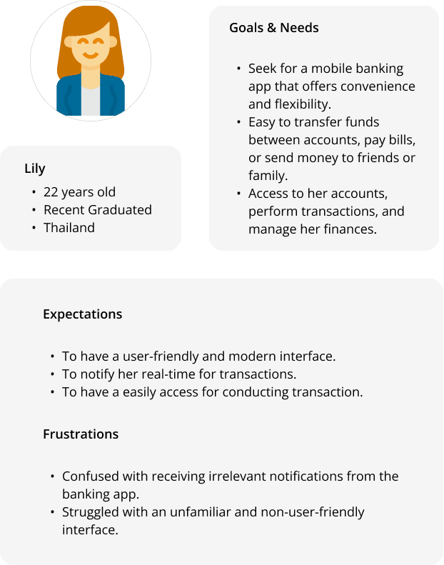
2
3
5